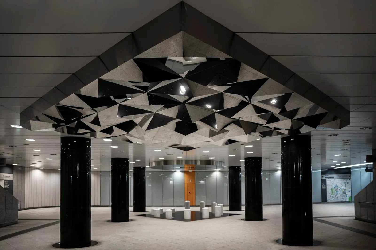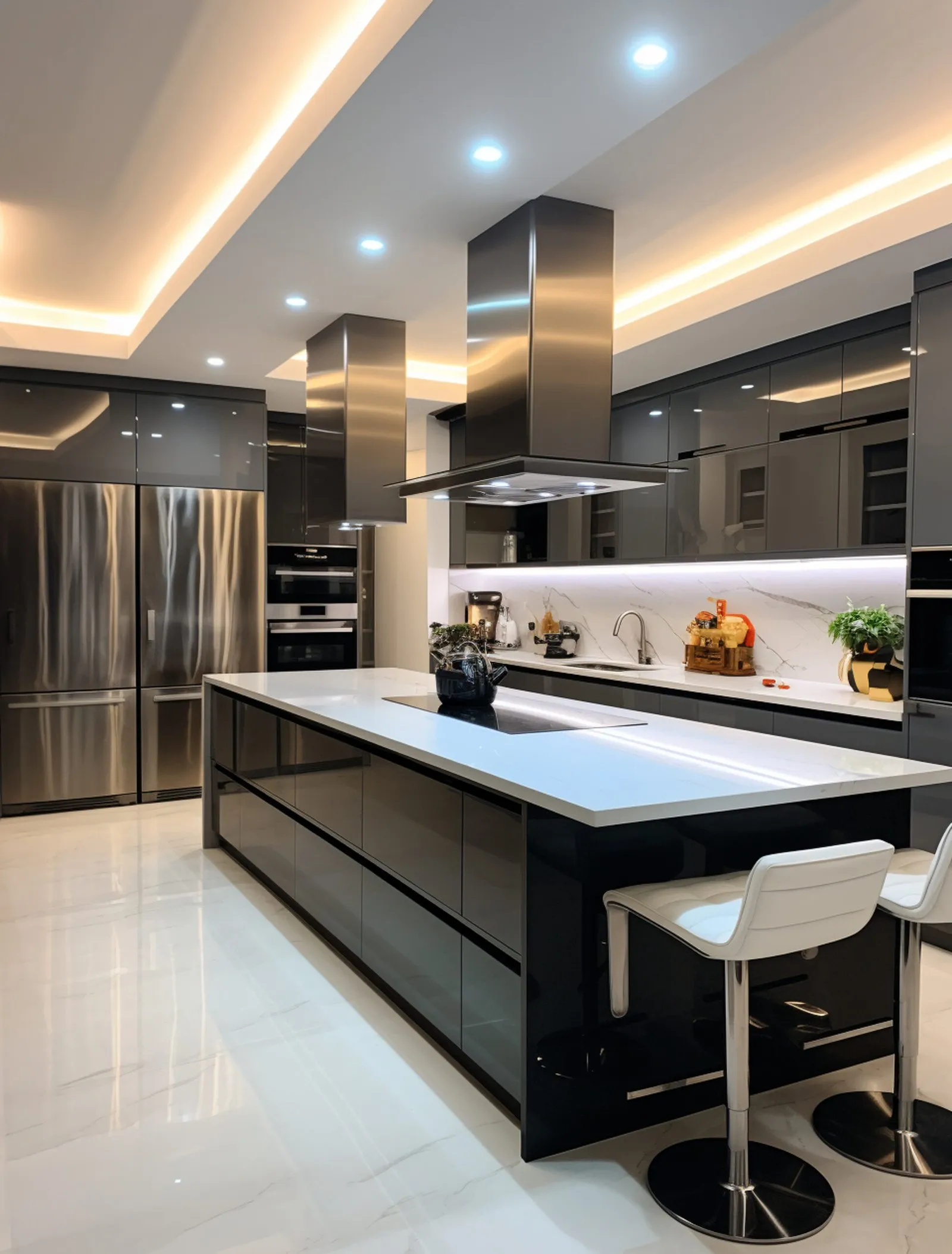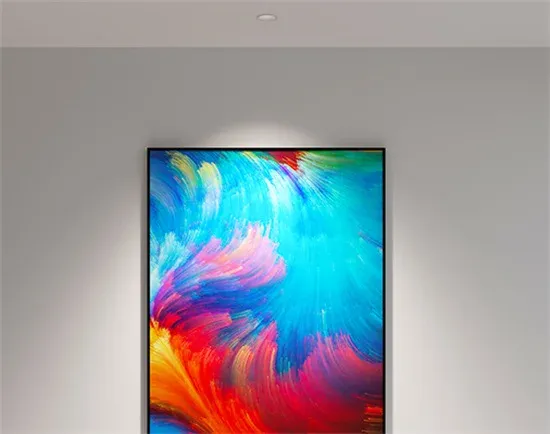
Two rooms, same paint, same furniture, same light level. In one the oak floor is oak and the terracotta pot is terracotta. In the other everything is a little grey, the way a supermarket car park is grey at night. The difference is not brightness and it is not color temperature. It is how completely the light source contains the colors it needs to show, and the number that summarizes it is CRI, the Color Rendering Index.
What the number is
CRI is a score from 0 to 100 for how faithfully a light source shows colors compared with a reference source of the same color temperature. For warm sources the reference is an incandescent filament, which by definition scores 100. For cool sources it is a daylight model. A lamp at 100 shows every test color exactly as the reference would. A lamp at 80 shows them noticeably shifted. Below 70, things start to look wrong in ways people notice without being able to say why.
Two consequences follow that are worth holding onto. CRI only compares sources at the same color temperature; a 2700K lamp and a 4000K lamp can both score 95 and look completely different from each other, because each is being compared with its own reference. And CRI says nothing about brightness. A source can be very bright and render color badly, and a candle renders color almost perfectly.
How it is measured, and why that matters
The standard test shines the source on eight pastel color samples, numbered R1 to R8, measures how far each one shifts from its appearance under the reference, and averages the eight results. That average is the CRI printed on the box, properly called Ra.
The eight samples are all fairly muted colors. None is a saturated red. That turns out to be the loophole through which most cheap LEDs pass. A white LED is a blue chip under a yellow phosphor, and the combination is naturally short of deep red. A chip can score 80 or even 85 on the eight pastel samples while rendering saturated red as brown, because saturated red was never in the test.
That is what R9 is for. R9 is a ninth sample, a strong red, reported separately. On an incandescent lamp it is 100. On a good LED it is 90 or above. On a typical 80 CRI LED it is often below 20 and can be negative. If a spec sheet gives a CRI but no R9, assume the R9 is poor. Skin tones, timber, red fabrics, meat, wine, brick and a large fraction of paintings all depend on it.
TM-30, the better measure
The industry has known about the eight-sample problem for decades and in 2015 the Illuminating Engineering Society published TM-30, which uses 99 samples spread across the whole range of real-world colors and reports two numbers. Rf is fidelity, the same idea as CRI but harder to game. Rg is gamut, which says whether the source makes colors more saturated than the reference (above 100) or duller (below 100). A source with Rf 90 and Rg 100 is accurate. Rf 85 with Rg 110 is slightly punchy, which some retailers prefer. Rf 85 with Rg 90 is dull.
TM-30 is now common on architectural spec sheets and rare on consumer packaging. Where it is given, prefer it. Where only CRI is given, ask for R9 as well, and treat the two numbers together as the minimum.
Reading the scores
- 95 to 100: reference quality. Galleries, retail for clothing and cosmetics, high-end residential, anywhere there is timber, stone or skin that matters. R9 should be 90 or better at this level.
- 90 to 95: very good. The floor for an architectural interior. Most of what we make sits at 95 to 97.
- 80 to 90: adequate for a garage, a corridor or a plant room. In a room people live or work in, everything will be slightly grey and nobody will be able to say why.
- Below 80: outdoor area lighting and not much else.
Why LEDs got a reputation for poor color
Early LEDs were 70 to 80 CRI with very poor R9, and they were installed in millions of ceilings in the first decade of the technology. The reputation stuck even as the chips improved, and the improvement came at a cost, since a phosphor mix that renders red well converts blue light less efficiently. A 97 CRI chip gives fewer lumens per watt than an 80 CRI chip of the same power. On our 15 watt downlight the difference is real but small, and it is the right trade in any room that people look at rather than pass through.
What it changes in practice
In a house: a beige wall that looks washed out under one set of downlights and warm under another has not changed color. The light has. The commonest complaint we hear about a finished room, that the paint looks wrong at night, is nearly always the CRI of whatever was installed.
In a shop: the classic test is a rack of red garments. Under 80 CRI they are all the same dull maroon. Under 95 CRI with high R9 they are the six different reds the buyer chose. Cosmetics counters, butchers and florists have the same problem in different colors.
In a gallery or a studio: the work was made under one light and will be judged under another. 95 or better with high R9 keeps the two as close as they can be.
At a bathroom mirror: the difference between 80 and 95 CRI is the difference between looking unwell and looking like yourself.
Specifying it
- Write the CRI and the R9 on the schedule, not just the CRI. Anything under 90 and 50 respectively should need a reason.
- Where TM-30 values are available, ask for Rf above 90 and Rg between 97 and 105.
- Check the figure applies to the color temperature you are ordering. Some ranges hit 95 at 3000K and 90 at 2700K.
- Keep one manufacturer and one chip family per room. Two sources at the same CRI can still render differently if their spectra differ.
- Do not let color rendering be traded for lumens. A room at 90 CRI and 20 footcandles looks better than one at 80 CRI and 30.
High CRI is standard across our architectural range: the static color temperatures on our downlights and spots run at 97 CRI, the tunable and dim to warm engines at 95. The exact values are on each spec sheet, and we will send the sheet for any fixture before you commit to it.
Planning a project? Our lighting design service turns plans into a photometric plan, fixture schedule, and final aim. Start with a design brief.