Color temperature is the number on the spec sheet that most affects how a room feels and is most often chosen by accident. It is also simpler than it looks once one confusion is cleared up: a lower number is warmer, a higher number is cooler, and the reason is a piece of physics rather than a convention. Here is what the number means, the rule that matters more than the number, and the values we specify by building type.
What Kelvin actually measures
Heat a piece of metal and it glows: first dull red, then orange, then yellow-white, then blue-white as it gets hotter. Color temperature describes light by naming the temperature, in kelvin, at which a glowing body would produce that color. A candle flame is around 1800K. An incandescent lamp filament runs near 2700K, which is why 2700K light looks like an old light bulb. Halogen is about 3000K. Noon sunlight is around 5500K, and an overcast sky can reach 6500K or higher. So the warm, amber end of the scale is the low numbers, and the cool, bluish end is the high numbers.
An LED does not glow from heat, so its color temperature is a correlated value: the temperature of the glowing body its light most resembles. This is why two 3000K LEDs can look slightly different. One may sit a touch green of the ideal line and the other a touch pink. The spec sheet figure for this is Duv, and a value close to zero is what you want. It is also why fixtures should come from one manufacturer and one binning tolerance per room, so that twelve downlights are twelve of the same white.
The rule that matters more than the number
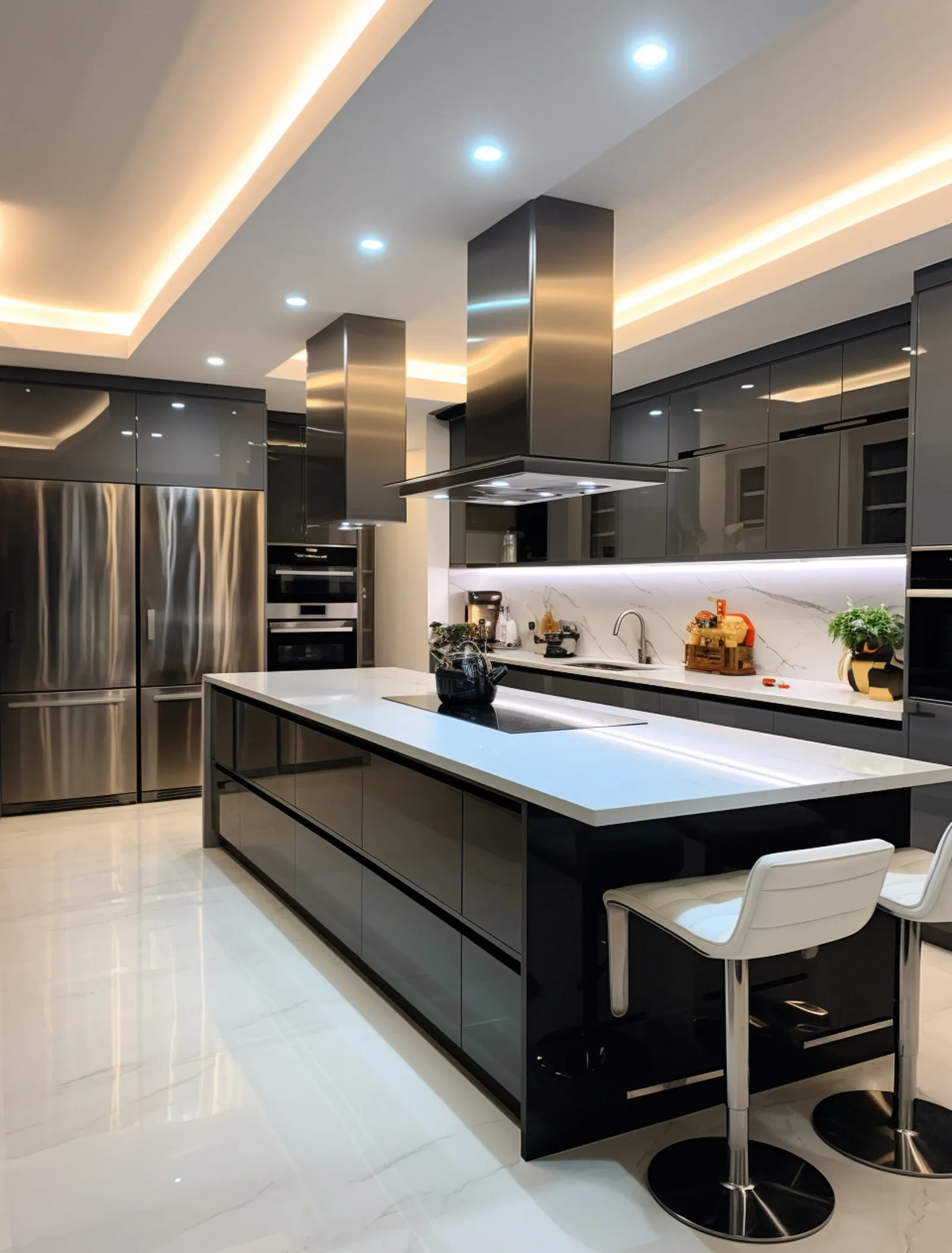
Keep one color temperature per sightline. A 3000K kitchen next to a 2700K living room in an open plan, or a 4000K range hood lamp above 3000K downlights, is the fastest way to make good fixtures look cheap, because the eye reads the difference as one set being dirty or wrong rather than as a design choice. Within a single room, this includes the under-cabinet strip, the lamp in the range hood, the LED in the pendant and the bulb in the table lamp. Any of them can break it.
Where two temperatures are genuinely wanted, put a wall or a doorway between them. A 2700K bedroom off a 3000K corridor is fine. A 2700K sofa looking at a 3000K kitchen is not.
Residential
Living rooms, bedrooms and dining rooms: 2700K. It is the color of the incandescent lamps people grew up with, it flatters skin and timber, and it is the temperature at which a room reads as rest rather than work. Some contemporary interiors with pale walls and a lot of glass go to 3000K throughout, and that works as long as it is throughout.
Kitchens: 3000K is the most common answer, warm enough to sit in and neutral enough that food and stone look right. 2700K if the kitchen is open to a 2700K living room. We do not recommend 3500K or above in a house; it makes a kitchen look like a laboratory at night, whatever it looks like at noon.
Bathrooms: 3000K at the mirror, since it renders skin honestly without the coldness of 4000K. Dim to warm engines that drift toward 1800K as they dim are worth specifying in a bathroom used at night.
Home offices and workshops: 3500K to 4000K if the room is used only for work, 3000K if it is also seen from the rest of the house. Do not go to 5000K indoors in a residence; the alertness argument for cool light is real but it comes at the cost of the room, and the effect on sleep is not worth it in the evening.
The evening question: many of the arguments about warm versus cool light dissolve with a tunable engine. A 2700K to 6500K range, or a dim to warm curve from 3000K to 1800K, lets the same fixtures run neutral at midday and amber at midnight.
Offices and workplaces
4000K is the working default for open plan offices in North America, and 3500K where the fit-out is more domestic in character. 5000K is used in laboratories, inspection areas and drafting studios where color discrimination is the task. What matters more than the number in an office is the vertical illumination on faces and walls, and the glare control of the fixtures; a 4000K office with bare sources feels harsh, and a 4000K office with regressed optics and washed walls feels crisp.
Retail
The temperature follows the merchandise. Clothing, leather, timber, cosmetics and anything sold on warmth: 3000K, occasionally 2700K in a luxury boutique. Jewelry, watches, white goods, electronics and anything sold on precision: 3500K to 4000K. Food retail splits by department, warm over the bakery and cheese, cooler over fish and produce, which is one of the few places where mixing temperatures under one roof is correct, because the departments are separate sightlines.
Color rendering matters as much as temperature here. A 3000K spot at 80 CRI makes a red dress brown. The same spot at 95 CRI with high R9 makes it red.
Hospitality
Lobbies, bars and restaurants: 2700K, with dim to warm on the accent layer so the evening scene drops toward 2200K and below. Guest rooms: 2700K, and ideally a tunable or dim to warm engine controlled from the bedside so the guest can wake to neutral light and sleep in amber. Back of house and kitchens: 4000K, behind a door.
The dining table rule: warm light makes food look appetizing, cool light makes it look clinical. Chefs know this; some restaurant kitchens at 4000K pass plates through to a dining room at 2700K, and the plate looks different on each side of the hatch.
Museums and galleries
The convention is 3000K for mixed collections, warm enough to flatter oil paint and timber frames and neutral enough for works with cool palettes. Contemporary white cube galleries often go to 3500K or 4000K so the walls read as white rather than cream. What is non-negotiable is color rendering, 95 CRI or better with high R9, and a source without ultraviolet. The light level is set by the conservator, not the designer: works on paper at 5 footcandles, oils at 15 to 20.
Malls, atria and public spaces
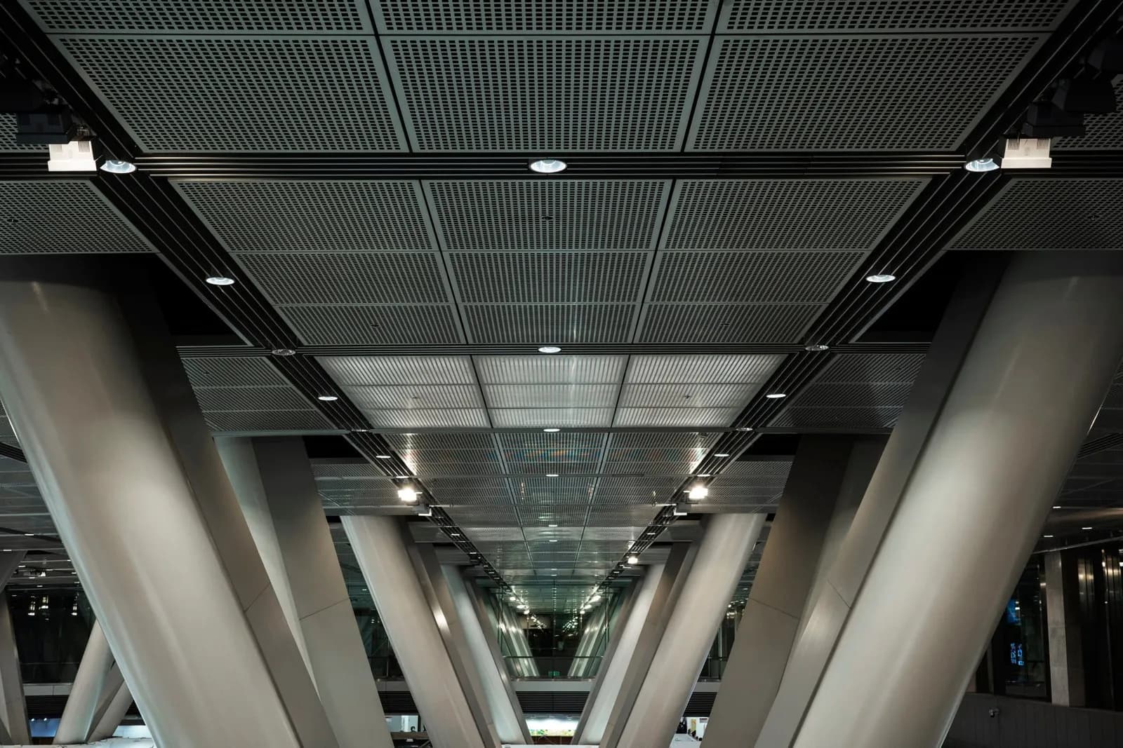
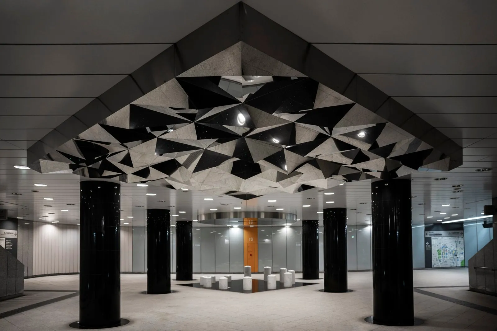
3500K to 4000K in the common areas, which reads as bright and clean without tipping into blue, and lets each tenant choose its own temperature inside its own frontage. The tenancy line is the sightline boundary. Where daylight enters through a roof, 4000K in the artificial light matches the daylight better through the middle of the day.
Choosing, in order
- Decide what the space is for: rest, work, sale or display.
- Pick the temperature for that use from the notes above.
- Apply it to every source in the sightline, including the ones that come with the appliances and the furniture.
- If the space is used at very different times of day, specify a tunable or dim to warm engine rather than compromising on a single number.
- Confirm the CRI and R9 alongside the temperature, since a warm light that renders poorly is not warm, it is yellow.
Our fixtures come in 2700K, 3000K, 3500K and 4000K static, in tunable white from 2700K to 6500K, and in dim to warm from 3000K to 1800K, at up to 97 CRI. If you are unsure which a room wants, send the plan and tell us how the room is used; the answer is usually obvious once the use is written down.
Planning a project? Our lighting design service turns plans into a photometric plan, fixture schedule, and final aim. Start with a design brief.